Featured designer: Nod Young
Nod Young is the art director/co-owner at Beijing-based Khaki Creative and Design and a graduate of the Academy of Arts & Design at Tsinghua. Today, we shall feature three of his works that represent his forays into crossing the chasm between analog and digital design.
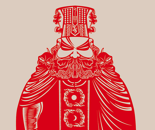
First up, using computer vector art to mimic and refine the aesthetic of traditional Chinese paper-cuts (剪纸). This one is of the King of Hell (阎王).
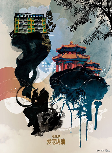
Second, using watercolor in a design that is often seen in vector form.

(An interesting aside: the four characters on the bottom of the image above (Ai Lou Hu You) is, according to Nod, “a phrase that dates back to the days of
early English learners who were learning to say “I love you.” It’s
funny that “Lao Hu” also happens to be the word for Tiger.”)
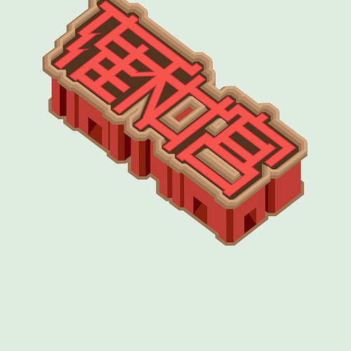
Thirdly, representing Chinese text as vector typography, always a difficult task because Chinese characters depend so much on small details (at least, compared to the English alphabet).
Link to Nod’s Flickr.


Wow, the Flickr link is something to see. As an amatuer typography fan, I’m very impressed by what he’s doing, stylizing characters like that. I don’t think your comment about Chinese text as vector typography is fair, though. If you look at publications from early 20th century Shanghai you’ll see some amazing creativity with fonts, like what Nod is doing but without the assistance of computers. You could just as well say (and again, wrongly) that with only 26 letters the amount of creativity that you can express in Western roman letters with type is very limited.
Yeah, it is and will be interesting to watch his typography designs evolve over time.
As for my comment about Chinese characters and English letters: I was thinking about legibility. Even with Nod’s work, sometimes it takes me a while to figure out what the characters are if I don’t look at the answer below (so to speak).
You don’t happen to have a link to the said 20th century Shanghai typography?
If you do a Baidu image search for 配书影, you’ll find a few collections of 20s and 30s novels (Xu Zhimo, Zhang Ziping, and various editions of The Sorrows of Young Werther), some of which have interesting typographic design. Nothing this sophisticated, but one or two are quite striking.
I don’t, I keep wanting to scan them in… You can see some examples, not great, from the Linglong magazine scans:
http://wwwapp.cc.columbia.edu/dkv/app/linglong/saxon?source=ling_mets/ling1934_138_mets.xml&style=styles/ling_xsl_38_1.xsl&clear-stylesheet-cache=yes
http://wwwapp.cc.columbia.edu/dkv/app/linglong/saxon?source=ling_mets/ling1934_138_mets.xml&style=styles/ling_xsl_61_1.xsl&clear-stylesheet-cache=yes
http://wwwapp.cc.columbia.edu/dkv/app/linglong/saxon?source=ling_mets/ling1934_138_mets.xml&style=styles/ling_xsl_23_1.xsl&clear-stylesheet-cache=yes
http://wwwapp.cc.columbia.edu/dkv/app/linglong/saxon?source=ling_mets/ling1934_138_mets.xml&style=styles/ling_xsl_27_1.xsl&clear-stylesheet-cache=yes
http://wwwapp.cc.columbia.edu/dkv/app/linglong/saxon?source=ling_mets/ling1937_284_mets.xml&style=styles/ling_xsl_43_1.xsl&clear-stylesheet-cache=yes
Of course, if I lived back then I may have complained that all art-deco fonts looked alike!