Chinese and English language website design
Have you ever been forced by a client to copy an English language website?
Have you ever been blamed by a leader for producing something “unsophisticated”?
Have you ever felt unsure when the “English” website you copied keeps on looking wrong?
For those of us who are interested in how people from different cultural contexts “see” things online differently–a different aesthetic, process of interpretation, set of referents, and so on–here’s my rough paraphrase and translation (in italics) of a fascinating article, “Brief Discussion of the Difference Between Chinese and English Website Design, by “Angela” on the idea-packed website Blueidea 蓝色理想, which focuses on web design. Angela sets out her own theory of why you can’t move web design for English language sites directly over to Chinese language sites. I don’t agree with everything she says, but her thoughts are provocative.
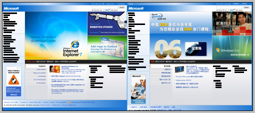
She begins by asking us to compare these two websites: Microsoft.com and Microsoft.com/China and asks, “Even though they use the same interface and configuration, don’t you think the Chinese site looks just a bit more chaotic?” Then she takes us through a step by step comparison of the two.
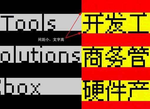
Starting with the menu: the Chinese menu looks more chaotic (though she doesn’t explain what she means exactly) and is longer than the same English menu. She enlarges a section of the menus to illustrate what makes it more chaotic:
The Chinese characters are taller than their English letter counterparts, leaving less empty space (the red as compared to the black stripes). It’s a small point, she says, but a critical one as the spatial relationship between color and text is what gives a website its look and feel.
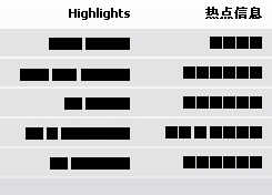
Next, the issue is the difference between Chinese and English individual characters and the effect this has on design. She reduces the size of the two websites and turns the character spaces black so you can compare them better.
The English words, with their different numbers of letters forming a column, appear as a natural wave–a form that is closer to the “inner nature of language,” she thinks.
Rhythm and meter are one of the widely accepts rules of aesthetics…Chinese characters, however, are square shaped, with each character occupying the same amount of space on the screen. And at the same time we have a habit (perhaps it comes from Chinese proverbs?) of using 4 characters for most of the items on the menu.
She gives us several more examples of the “4 character” habit:
This “homogenous layout” can easily turn already highly normalized, square Chinese characters into an something like an iron bar.
Another example to illustrate what Angela contrasts as flowing, natural meter of language versus the stiff, precise, unrhythmic effect of Chinese characters is given by blacking out the word clusters on a pulldown menu in groups as they would be read–that is, “in words for English and in characters for Chinese.” [However, any Chinese characters are part of 2 or 3 character clusters that themselves are the real unit.] She characterizes the visual rhythm of the English word clusters as more varied, with long and short; while the Chinese characters are a monotonous “da! da! da! da!”

The characteristics of occupying the same, fixed amount of space for each character are shared by Korean and Japanese, she writes, but are worst with Chinese.
The last point: The “power return” at the end of each line of words
or characters works differently with English words than with Chinese characters. Where the word is the
main design unit, words have different numbers of letters and therefore
naturally create a random pattern of white space, as opposed to Chinese
(or Korean) where the character is the main design unit and they march to the same
edge each time (unless it’s the end of a sentence). This, she explains,
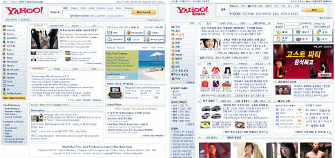
is why so many Chinese websites look “crowded.” Compare the two websites below, the same design but one in English and one in Korean, and the difference is clear.
A final summary:
1. Chinese characters leave too little empty space when compared to English language letters in the same design layout.
2. Chinese characters lack a wavy, up and down 起伏 rhythm.
3. The power return of Chinese characters is a serious limitation for design.
Result: If you’re not careful, Chinese design can easily turn as a rigid as a bar of iron.
There are many ways to resolve the issues, Angela says, and suggests at the very least paying attention the the web designs of Japan and South Korea over the past few years.


WOW, great find! And the Chinese characters are probably the most dense (v.s. Japanese, Korean) too!
SOME CHINESE GOODIES.
My inbox has brought me some Chinese-related material, which I will now share with you. 1) Lyn Jeffery at Virtual China has a post in which she discusses an article on “why you can’t move web design for English language…
As far as I know it’s not something which has entered into the picture, but do you think that the aesthetics of vertical text could affect these sorts of problems?
I’ve often wondered whether acceptance of horizontal rather than vertical text in Asian languages is just an artifact of computer systems, or whether other historical processes played a part in popularizing it.
I only have a smattering of Japanese, myself, but I’ve always found vertically printed Japanese to look more elegant than the horizontal variety…
Patrick — It’s a great question. I would love to know more about how horizontal L to R text became the norm in China, as opposed to vertical R to L as one finds in older manuscripts. I have read somewhere about the different design possibilities inherent in being able to print both horizontally and vertically, both L to R and R to L, in terms of Chinese newspaper design.
This reminds me of the time when I was working on a four-language (Japanese/Traditional Chinese/Korean/English) website. They wanted to implement a new design created by a Japanese designer. It wasn’t just a case of looking unappealing: we couldn’t even fit the English text into the fixed spaces allowed by the layout! Korean and Chinese were all right, as the text length didn’t differ substantially, but English was almost always much longer.
Patrick: I have a book of 20th century Japanese advertising that is quite interesting. Everything in there is right-to-left (where it’s not vertical, of course) up until the 1930s; even after that, it’s only high-tech products that use left-to-right: National light bulbs; Sharp radios; dihydrocodeine-based cough medicine. A bit later, Western fashions are also advertised by L-to-R copy. By the 1950s, however, everything is left-to-right. I don’t know the exact history, but it seems that in Japan the gradual trend towards L-to-R writing was codified by the post-war writing reforms.
I suspect that Chinese writing reforms after the revolution had a similar effect in the PRC; I wonder how much was written left-to-right before then.
As somebody who reads and writes English and chinese, I do know the challenges of converting an English web site to A Chinese website.
But what about converting chinese to english website?
I’ve been also going on about that in a lot of posts about chinese websites,
a few months ago I talked to the founder of a very famous web 2.0 service here in China and I asked him why isn’t the site more simple like it’s english language counterpart.
He gave me an explanation like this:
that chinese people need the chaotic design to stick to a page,
in chinese peoples mind it means that somethings going on on the page, ( a friend of mine said that too ) if it’s simple they may think awww this is empty, nothing you can do here.
Dear Sir/ Madam,
Sub: Strategic Partnership.
We would like to introduce ourselves as Starsoft-India, a software development company based in Mysore (88 miles south of Bangalore, India). We are an IT solutions, consultancy, and services provider focused on delivering affordable, quality-based business and technology solutions to small, medium, and large organizations worldwide.
We are a growing company with an experience of 5 years in the IT field. We have young and talented employees producing quality IT products and are proficient in Asp, VB.net, MSSql, VB, Oracle, Flash, etc. Currently we are looking forward to make a strategic partnership/business alliance with young companies outside India, serving their needs as an offshore development team, efficiently and both growing equally and strongly.
We look forward to hear from you. Kindly provide us with the opportunity to serve your esteemed organization to the best of our abilities and oblige.
We request you to visit our website http://www.starsoft-india.com, to verify our skill sets.
Thank you very much,
Yours truly,
Amar Achaiah,
Starsoft
C-51, Industrial Estate, Yadavagiri,
Mysore – 570 020.
Karnataka.
India.
Ph: 91-821-2413310, 91-821-2413315
Fax: 91-821-2515884
Email: info@starsoft-india.com
Email: amar@starsoft-india.com
Hi,
This is a good post on the aesthetic differences between Chinese and English sites. I am a designer with FreeReid.com and when I first started developing sites in this market, I was totally arrogant. I said, hey the Chinese are just behind the times, their technology is bacward but in a few years they will come around to the idea of simple, useful design.
It has now been a few years and I would say that I am only partly right. People still look at extremely clean sites as being small but I do think that the market is demanding increasingly solid code.
–AC
PS: Of course, you can check out FreeReid for a highend Chinese or English website.
Hello! great idea of color of this siyte!
Having made websites in China for a few years, and coming from Canada I would say the Chinese character structure is the main difference. When westerners look at something they don’t understand (characters) it looks confusing and chaotic.
Lots of the differences are purely cultural, and due to the fact that the internet audience is not as developed as back in the west (in terms of amount of years looking at websites, and the competency of Chinese programmers). Most Chinese websites look like the ones made 4 years ago in the west. I also have seen minor improvements in Chinese design but for some reason Chinese people, culture, and tastes prefer crowded sites with blinking objects. Clean sites do not have the ‘stickiness’ factor.
If you would like to see some examples of proper Chinese websites, or are interested in having your website localized in China please have a look at my company website;
http://www.newviewit.com
I look forward to hearing back from you!
Derek
Hello
I have 2 web sites to be developed.
1 – B2B web site similar to http://www.ec21.com with some amendments and simpler.
2 – Videos site similar to http://www.metacafe.com with some amendments and simpler.
Please let me the approximate cost.
If you to chat with me on yahoo please let me know the time you will be online.
I am located in Egypt.
Regards
Talal
jobs@yahoo.com