China’s innovative news dashboards, good information design on the rise
The China Media Project, based out of the Hong Kong University, ran a recent blog article called QQ runs interactive feature page on the problem of “fake reporters” in China, which pointed out the wave of innovative news dashboards coming out of Mainland Chinese online news sites.
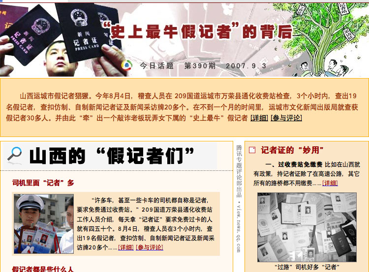
The screen below, taken from the QQ news page suggested by China Media Project, has a graphic-intensive title (roughly translated as “Uncovering the most fake reporter in history”), below which is a snippet of the latest news.
Then on the left are the previews/summaries of full articles accompanied by the respective photographs, and on the right are some primary sources that give a look inside the “fake reporter’s” world.
Then if you scroll down, there is an reader poll on the right and then a box on the left for reader’s comments (but in a format more reminiscent of BBSs than blog comments).
I find it interesting how they’ve managed to leverage the screen to put up multiple articles, viewpoints and pieces of evidence (rather than the typical one article per page format that most news sites take).
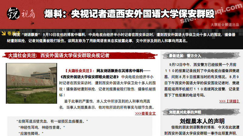
The feature article below, from daqi 大旗, uses a similar two column layout, with previewed articles on the left and reader comments on the right. What they also do is quote an excerpt from Baidu Post (the Baidu all-purpose BBS) as a way of putting up another viewpoint.
Note, however, that these are the dashboard views for feature news items that have had multiple articles written on them. So they do not replace the current single-page articles (which are linked to) but they do augment the currently article-centered news.

