Forging a Hong Kong identity through fonts: mapping the city’s digital typefaces
Hong Kong typography made global headlines in 2022 over a grassroots effort to preserve a font originally handmade by incarcerated people. The project aimed to create a new digital typeface, Prison Gothic, based on the way Chinese characters were written on the city’s road signs from the 1970s to 1990s, when they were hand-carved at the Pak Sha Wan Correctional Institute. A crowdfunding campaign for the project in 2022 was a resounding success, raising over $170,000 (USD) at 191% of its initial goal, and anyone can buy the font today for roughly $300. While the ethics of preserving and commercializing the output of incarcerated labor is debatable, the success of this project did spur me to find out what other grassroots or independent typographic projects have been coming out of Hong Kong over the past two decades.
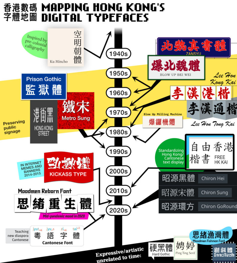
Over the last two years, I found and mapped out 20 Chinese language fonts created by a solo or small team of typographers in or from Hong Kong. The map above includes all the complete (or almost-complete) Chinese fonts made from 2002 to 2024. I’ve limited my selection to Chinese fonts because making one requires a gargantuan amount of effort — at minimum, typographers have to create designs for at least 4000 characters (whereas an English language font can get away with as little as 256 characters). I only sought out fonts made by individuals or small teams because their works are the ones that have been making local and international headlines, and because corporate type foundries mostly focus on making Simplified Chinese fonts for the much-larger Mainland China market.
The arrows coming out of the fonts on the map link them to the period (or moment) of time in Hong Kong that they reference. Together, they paint a picture of the city’s history, design and technology over the decades. In chronological order:
- 空明朝體 Ku Mincho is an all-purpose font that references precolonial-era Chinese calligraphy.
- 北魏真書體 Zansyu and 爆北魏體 Blow Up Bei Wei are both based on the forceful and often sculpted Beiwei Style calligraphic signage that became widespread in Hong Kong in the 1950s to 1970s, which includes the neon-light billboards that the city is known for.
- 李漢港楷 Lee Hon Kong Kai and 李漢通楷 Lee Hon Tong Kai are based on samples from renowned street calligrapher Lee Hon, whose works were used to create many plastic signs big and small throughout the city in the 1970s and 80s.
- 監獄體 Prison Gothic, 鐵宋 Metro Sung, and 香港馬路體 Hong Kong Street Face are all based on transportation signage (highway, subway and road respectively) made in or popularized during the 1970s to 1990s.
- 爆鑼機體 Blow Up Milling Machine is based on small public, plastic notice boards that contain writing that had to be hand carved with milling machines in/around the 1980s.
- 自由香港楷書 Free HK Kai is a 2010s-era community initiative for seniors to collectively create a classic, free and open Hong Kong Chinese font, as open source Chinese fonts were not available at the time.
- 勁揪體 Kickass Type is based on the writing style used in the creator’s own webcomics and designs, which exploded in popularity in 2014-2015 particularly after a “Hong Kong Kick Ass” banner at a football match went viral.
- 昭源黑體 Chiron Hei, 昭源宋體 Chiron Sung and 昭源環方 Chiron GoRound were all created in the 2020s as Hong Kong adaptations of a set of open source Traditional Chinese fonts created by Adobe and Google.
- 思緒重生體 Moodmen Reborn was launched during the deep lull of the 2020 pandemic with a message to fellow Hong Kongers to rebound back and be “reborn.”
- 粵語字體 Cantonese Font is a tool for teaching Cantonese, particularly for the “[new 2019-2022] diaspora community.” It builds on Chiron Hei/Sung fonts by adding styled Jyutping pronunciation guides on top of the Chinese characters automatically.
Of the 20 fonts, only 4 (硬黑體 Hard Gothic, 娉婷 Ping Ting Serif, 創科字體 Innotech and 思緒漁灣體 Moodmen Fishman) felt unmoored from city’s history, though even then they are all still very much tailored to the Hong Kong market.
Meanwhile, 8 out of 20 fonts that act as de facto cultural preservation, being based directly on Chinese typography used on old public signage. Yet these font projects are much more than acts of preservation. Their creators do not just trace photos of old signs and make a font out of it — they add their own artistic flair, make legibility adjustments, and extrapolate from what’s documented/available to create a 6000+ character set font. In this way, they also extend the life of decades-old signs, where typography plays an integral role in its unique aesthetic. As Metro Sung’s Sammy Or says, they “hope to pass on this uniquely Hong Kong style cultural heritage in a modern digital way” (MetroSung.hk).
So it’s no surprise then that the origin stories and creative processes behind many of the fonts are intertwined with the Hong Kong identity. Reflecting on the past and present, Kickass Type’s Kit Man says of his font, “I would say design can help give voice to many things in society” (City of Scripts 2: Hong Kong Type Designers, P242). Meanwhile, Ku Mincho’s Julius Hui and Blow Up Font’s K Sir both say their typefaces represent Hong Kong people today. The former explains that the font’s use of uniquely carved-out, curved corners creates a sense of speed for the city’s people who dislike delays and dragging their feet (City of Scripts 2: Hong Kong Type Designers, P216). The latter comments that his font is connected to the Hong Kong spirit in its straightforwardness, flexibility and the hardworking “can-do” Lion Rock Spirit (City of Scripts 2: Hong Kong Type Designers, P362).
Some of the typographers also think of their projects as vehicles towards a future Hong Kong identity. Moodmen Reborn’s Roy Chan named his font Reborn on the idea that “as long as there is creativity and newness in there, then the [fading] soul of Hong Kong can actually be reawakened” (2022 interview on Simon’s Global Microcosm, 4:10). Meanwhile, to bridge the past and the future, Zansyu’s Adonian Chan asks, “This very important visual culture heritage, is there a way to reinterpret it into a new design, and turn it into something we are all proud of… And can this typeface transcend Hong Kong and be used in Chinese-speaking places overseas? At the core, I want to ask what does the Hong Kong identity embody?” (2022 interview on Happy Kongner, 20:38)
It makes sense that the city’s typographers are driven not only by profit but also by cultural and artistic ideals. Designing a Chinese font takes years of work, and since the Hong Kong market is small, the time and labor required may never pay off financially. Yet, as we’ve seen, their typeface projects are rewarding in other ways — as a means to pass on a cultural legacy or forge a new cultural identity. It is these artistic motives that bring a certain depth and complexity to the work and make them that much more deserving of our attention. The Prison Gothic project may have singularly captivated the international press, but it is far from the only typographic project from Hong Kong with an interesting story to tell. It and the 19 other typefaces I’ve mapped out carry with them the history of the city, the penmanship of notable calligraphers, the nuanced design choices of their creators, and, as some have said, the spirit of Hong Kong.
Author’s note: An earlier version of this research was presented at the Backreading Hong Kong Symposium: Translating Hong Kong 2 symposium in November of 2023.
March 19 update: Updated the map and text to include 粵語字體 Cantonese Font.
Appendix: The fonts and their creators
- 空明朝體 Ku Mincho by Kowloon Type/Julius Hui
- 北魏真書體 Zansyu by Adonian Chan
- 爆北魏體 Blow Up Beiwei by K Sir
- 李漢港楷 Lee Hon Kong Kai by Lee Kin Ming
- 李漢通楷 Lee Hon Tong Kai by Lee Kin Ming
- 監獄體 Prison Gothic by Road Research Society
- 鐵宋 Metro Sung by Sammy Or
- 香港馬路體 Hong Kong Street Face by Roman Wilhelm
- 爆鑼機體 Blow Up Milling Machine by K Sir
- 自由香港楷書 Free HK Kai by H.K.S.K.H. Lady MacLehose Centre’s Dr. Lam Chik Suen District Elderly Community Centre and Hong Kong Creative Open Technology Association
- 勁揪體 Kickass Type by Kit Man
- 昭源黑體Chiron Hei by Tamcy
- 昭源宋體 Chiron Sung by Tamcy
- 昭源環方 Chiron GoRound by Tamcy
- 思緒重生體 Moodmen Reborn by Moodmen/Roy Chan
- 粵語字體 Cantonese Font by Visual Fonts/Jon Chui
- 硬黑體 Hard Gothic by Enextype/Eddie Yuen Hing-cheong
- 娉婷 Ping Ting Serif by Enextype/Eddie Yuen Hing-cheong
- 創科字體 Innotech by Eric Chan
- 思緒漁灣體 Moodmen Fishman by Moodmen/Roy Chan