mapping the Internet

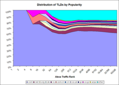
Maps help non-technical people like me conceptualize the Internet (if you know of China-specific Internet maps, please do let me know and I’ll blog them). Geoffrey Mack has a great new graph posted on the blog at Alexa.com, done by Alexa’s Applications Engineer, Derrick Pallas. It shows the distribution of top level domains (TLDs) by traffic. Dot-com (medium blue) is by far the most trafficked of the TLDs, but you can see that .com.cn (orange) and even .cn (dark blue) are pretty well-represented. Mack notes that:
Some of the most interesting and somewhat surprising datapoints occur
in the ranks 5 through 50 range, where both China and Japan are well
represented. But, further down the ranks, both China and Japan begin to
fall off and represent relatively small portion of the top 65K sites. Conversely, Russia is underpresented in the top sites, but out at the farther reaches of the graph is fairly well represented.
…if we were to redraw the graph showing the reach [note: the “reach” means what percentage of net users visit the site in any given day] of the TLDs, is that
the TLDs shown on the left of the graph would have a much larger
influence on the right of the graph. Meaning the graph would become
mostly blue, with some orange for China, some pink for Japan, and not
much else.
Chinese sites like Sina.com and QQ.com will reach an increasingly large percentage of the global Internet user population as more Chinese get online.